Background Color
The backgroundColor control provides an interface for selecting and customizing background colors, including solid colors, gradients, and animated gradients. This component includes a variety of options to fine-tune the color selection, including opacity, gradient type, and the ability to input specific color values.
Example of the control:
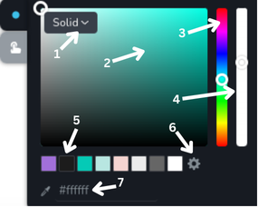
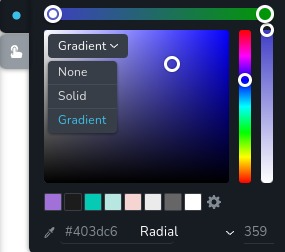
- Background type dropdown menu - this dropdown menu allows you to choose which type to apply to the background. It has 3 options:
None,SolidandGradient. WhenwithAnimatedGradientconfig is enabled, it also includes anAnimated Gradientoption. - Color selector area - this is where you can pick the exact color by clicking on the desired point within the color gradient.
- Hue slider - this vertical slider allows you to choose the hue (basic color) you want to work with.
- Opacity slider - this slider lets you adjust the opacity of the selected color.
- Color presets - these are preset color options from global styles that you can quickly select.
- Settings icon - opens sidebar with the global styles.
- Hex color input - this area shows the hexadecimal color code of the selected color and allows you to input a specific hex code to choose a color directly. The eyedropper icon next to it lets you select any color from anywhere on the page by clicking on it.
Example of the control with the Gradient type:
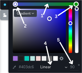
- Gradient colors slider - this horizontal slider shows the current colors used in the gradient.
- Gradient start handle - this handle allows you to select the starting color of the gradient on the gradient colors slider. It is currently selected, indicated by the circle inside it.
- Gradient end handle - this handle allows you to select the ending color of the gradient on the gradient colors slider. It is not currently selected.
- Gradient type dropdown - this dropdown menu allows you to choose gradient type. It has 2 options:
LinearandRadial. - Gradient angle - this input field allows you to specify the angle for the gradient.
Example of the control with dropdown opened:
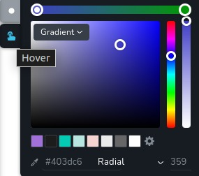
Example of the control with state "hover":
Parameters
| Name | Type | Default | Description |
|---|---|---|---|
id | string | - | The identifier of the key where the backgroundColor will save your data |
type | string | - | Type should be "backgroundColor" to use this control |
position? | number | - | The position of the control in toolbar |
roles? | Array<Role> | - | Render the control only if the current user's role matches one of the roles in the provided array. type Role = "admin" | "viewer" | "editor" | "designer" | "manager" |
devices? | "all" | "desktop" | "responsive" | "all" | Define the devices where the control will be rendered. "all" renders the control on all devices. "desktop" renders the control only on desktop devices. "responsive" renders the control on both tablet and mobile devices |
disabled? | boolean | false | Configure the condition under which the control is disabled or enabled |
states? | Array<State> | ["normal"] | Allows the control to work in different states. State = "normal" | "hover" | "active" "normal" - the normal state of an element, "hover" - the state when the element is hovered over, "active" - the state when the element is active (e.g., current page in pagination) |
config?.opacity | boolean | true | Controls whether the opacity of the background color can be changed. If set to false, the opacity slider will not be rendered. |
config?.withNone | boolean | true | Determines whether the None option is included in the dropdown menu for background type |
config?.withAnimatedGradient | boolean | false | Enables the Animated Gradient option in the background type dropdown menu. When enabled, users can create animated gradients with multiple color stops and adjustable animation speed. |
default? | Default | - | The default control value. Accepts all the fields as in the example |
selector? | string | - | The CSS selector to which the styles will be applied |
style? | function | - | This function generates CSS output based on the value from the control. The parameter is an object containing a value key, which holds the current value of the control. Additionally, when a palette color is selected, extra keys are provided in value: paletteVar for palette, and gradientPaletteVar for gradientPalette. Each contains the CSS variable for the selected palette (e.g. --brz-global-color7), or null if not set. The value of these CSS variables is an rgb triplet in the format r,g,b. The function returns an object with a CSS selector key and CSS property values.
|
Basic example
Standard definition with only the required keys. This control will be displayed on all devices.
{
  id: "backgroundColor",
  type: "backgroundColor"
}
Return value
Returns an object with the following values:
{
  active: "start" | "end";
  end: number;
  gradientHex: string;
  gradientOpacity: number;
  gradientPalette: string;
  gradientType: "linear" | "radial";
  hex: string;
  linearDegree: number;
  opacity: number;
  palette: string;
  radialDegree: number;
  start: number;
  type: "solid" | "gradient" | "animated-gradient";
  // Animated gradient properties (only present when type is "animated-gradient")
  gradientSpeed?: number;
  gradientStops?: Array<{
    position: number;
    hex: string;
    opacity: number;
    palette: string;
  }>;
  activeStopIndex?: number;
}
active - a string indicating the currently selected handle when changing the start or end color of the gradient. It can be either "start" or "end";
end - a number indicating the position of the handle for the end color of the gradient on the gradient colors slider, where 100 represents the end of the slider and 0 represents the start;
gradientHex - a string representing the hex code of the selected color for the end handle of the gradient;
gradientOpacity - the opacity level of the color for the end handle of the gradient, ranging from 0 (completely transparent) to 1 (completely opaque);
gradientPalette - a predefined palette from the global styles for the end handle of the gradient;
gradientType - a string that specifies the type of gradient. It can be either "linear" for a linear gradient or "radial" for a radial gradient;
hex - a string representing the hex code of the selected color;
linearDegree - a number representing the angle of the linear gradient in degrees;
opacity - a number representing the opacity level of the selected color, ranging from 0 (completely transparent) to 1 (completely opaque).
palette - a predefined palette from the global styles;
radialDegree - a number representing the angle of the radial gradient in degrees;
start - a number indicating the position of the handle for the start color of the gradient on the gradient colors slider, where 100 represents the end of the slider and 0 represents the start;
type - a string that specifies the type of background color. It can be "solid" for a solid color, "gradient" for a static gradient, or "animated-gradient" for an animated gradient;
gradientSpeed - (optional, only for animated gradients) a number representing the animation speed of the gradient. Higher values result in faster animation. Default is 1;
gradientStops - (optional, only for animated gradients) an array of gradient stop objects, each containing position (number, 0-100), hex (string), opacity (number, 0-1), and palette (string). Multiple stops allow for complex animated gradient effects;
activeStopIndex - (optional, only for animated gradients) a number indicating the index of the currently active gradient stop being edited. Default is 0;
Example of the value for a solid color:
{
  active: "start",
  end: 100,
  gradientHex: "#009900",
  gradientOpacity: 1,
  gradientPalette: "",
  gradientType: "linear",
  hex: "#c02121",
  linearDegree: 90,
  opacity: 1,
  palette: "",
  radialDegree: 90,
  start: 0,
  type: "solid"
}
Example of the value for an animated gradient:
{
  active: "start",
  end: 100,
  gradientHex: "#009900",
  gradientOpacity: 1,
  gradientPalette: "",
  gradientType: "linear",
  hex: "#c02121",
  linearDegree: 90,
  opacity: 1,
  palette: "",
  radialDegree: 90,
  start: 0,
  type: "animated-gradient",
  gradientSpeed: 2,
  activeStopIndex: 0,
  gradientStops: [
    {
      position: 0,
      hex: "#c02121",
      opacity: 1,
      palette: ""
    },
    {
      position: 50,
      hex: "#ff6600",
      opacity: 0.8,
      palette: ""
    },
    {
      position: 100,
      hex: "#009900",
      opacity: 1,
      palette: ""
    }
  ]
}
Usage
Roles example
Show the control only to users with admin and designer privileges.
{
  id: "backgroundColor",
  type: "backgroundColor",
  roles: ["admin", "designer"]
}
Devices examples
It will be rendered on all devices. This value can be skipped because it is set to "all" by default.
{
  id: "backgroundColor",
  type: "backgroundColor",
  devices: "all"
}
Rendering will occur only on desktop.
{
  id: "backgroundColor",
  type: "backgroundColor",
  devices: "desktop"
}
The display is limited to responsive modes, specifically tablet and mobile.
{
  id: "backgroundColor",
  type: "backgroundColor",
  devices: "responsive"
}
Disabled examples
Control will be disabled. Normally, here should be your dynamic condition.
{
  id: "backgroundColor",
  type: "backgroundColor",
  disabled: true
}
Control will be disabled when videoType variable will be "custom".
getValue is a getter function that allows us to retrieve the value of controls by their id.
"videoType" is the id of the "select" control below.
const getToolbarContols = ({ getValue }) => {
  const videoType = getValue("videoType");

  return [
    {
      id: "videoType",
      type: "select",
      choices: [
        { title: "Youtube", value: "youtube" },
        { title: "Custom", value: "custom" },
      ],
    },
    {
      id: "backgroundColor",
      type: "backgroundColor",
      disabled: videoType === "custom",
    },
  ];
};
States example
Allows the control to work in normal and hover states.
{
  id: "backgroundColor",
  type: "backgroundColor",
  states: ["normal", "hover"]
}
Allows the control to work in normal, hover and active states.
{
  id: "backgroundColor",
  type: "backgroundColor",
  states: ["normal", "hover", "active"]
}
Config opacity example
Controls whether the opacity of the border can be changed. If set to false, the opacity slider will not be rendered.
{
  id: "backgroundColor",
  type: "backgroundColor",
  config: {
    opacity: false
  }
}
Config withNone example
Determines whether the None option is included in the dropdown menu for background type.
{
  id: "backgroundColor",
  type: "backgroundColor",
  config: {
    withNone: false
  }
}
Config withAnimatedGradient example
Enables the Animated Gradient option in the background type dropdown. When enabled, users can create animated gradients with multiple color stops and adjustable animation speed.
{
  id: "backgroundColor",
  type: "backgroundColor",
  config: {
    withAnimatedGradient: true
  }
}
When withAnimatedGradient is enabled, the control provides additional functionality:
- Multiple gradient stops can be added, edited, and removed
- Each gradient stop has its own position (0-100%), color (hex), opacity (0-1), and optional palette reference
- Animation speed can be adjusted to control how fast the gradient animates
- The active stop index indicates which gradient stop is currently being edited
Default value example
In the default object you can set the default values for any backgroundColor properties.
{
  id: "backgroundColor",
  type: "backgroundColor",
  default: {
    gradientActivePointer: "start",
    gradientEndPointer: 100,
    gradientColorHex: "#009900",
    gradientColorOpacity: 1,
    gradientColorPalette: "",
    gradientType: "linear",
    bgColorHex: "#c02121",
    gradientLinearDegree: 90,
    bgColorOpacity: 1,
    bgColorPalette: "",
    gradientRadialDegree: 90,
    gradientStartPointer: 0,
    bgColorType: "solid"
  }
}
CSS examples (selector, style)
Using selector, all styles will be automatically applied to the element that matches the selector.
{
  id: "backgroundColor",
  type: "backgroundColor",
  selector: "{{WRAPPER}}:hover .brz-ui-ed-iframe"
}
By using style, you can manually apply specific styles to the necessary elements.
{
  id: "backgroundColor",
  type: "backgroundColor",
  style: ({ value }) => {
    return {
      "{{WRAPPER}}:hover .brz-ui-ed-iframe": {
        "background-color": value.hex
      }
    }
  }
}
Additional example using the palette CSS variable (variable value is r,g,b):
{
  id: "backgroundColor",
  type: "backgroundColor",
  style: ({ value }) => {
    return {
      "{{WRAPPER}} .brz-ui-ed-iframe": {
        // rgba(var(--brz-global-colorN), opacity)
        "background-color": value.paletteVar
          ? `rgba(var(${value.paletteVar}), ${value.opacity})`
          : value.hex
      }
    }
  }
}
Animated gradient CSS example
Example showing how to generate CSS for animated gradients with multiple color stops and animation:
{
  id: "backgroundColor",
  type: "backgroundColor",
  config: {
    withAnimatedGradient: true
  },
  style: ({ value, config }) => {
    // Helper function to get color with opacity and palette support
    const getColor = (palette, hex, opacity) => {
      if (palette && value[`${palette}PaletteVar`]) {
        const paletteVar = value[`${palette}PaletteVar`];
        return `rgba(var(${paletteVar}), ${opacity})`;
      }
      // Convert hex to rgba
      const r = parseInt(hex.slice(1, 3), 16);
      const g = parseInt(hex.slice(3, 5), 16);
      const b = parseInt(hex.slice(5, 7), 16);
      return `rgba(${r}, ${g}, ${b}, ${opacity})`;
    };

    if (value.type === "animated-gradient" && value.gradientStops?.length) {
      const gradientStops = value.gradientStops;
      const gradientLength = gradientStops.length;
      const gradientSpeed = value.gradientSpeed || 1;
      const linearDegree = value.linearDegree || 0;

      // Build gradient values from stops
      const gradientValues = gradientStops
        .map((stop) => {
          const color = getColor(stop.palette, stop.hex, stop.opacity);
          return `${color} ${stop.position}%`;
        })
        .join(", ");

      // Calculate animation speed (similar to utils.ts implementation)
      const MAX_SPEED = gradientLength * 10;
      const backgroundSize = gradientLength * 60;
      const clampedSpeed = Math.max(1, Math.min(gradientSpeed, MAX_SPEED));
      const speed = MAX_SPEED / clampedSpeed;

      // Generate CSS with linear-gradient, animation, and background-size
      const gradientCSS = `linear-gradient(${linearDegree}deg, ${gradientValues})`;
      const animationCSS = `gradient-animation ${speed}s ease infinite`;
      const backgroundSizeCSS = `${backgroundSize}% ${backgroundSize}%`;

      return {
        "{{WRAPPER}} .brz-ui-ed-iframe": {
          "background-image": gradientCSS,
          "animation": animationCSS,
          "background-size": backgroundSizeCSS
        }
      };
    }

    // Fallback for other types
    return {
      "{{WRAPPER}} .brz-ui-ed-iframe": {
        "background-color": value.hex
      }
    };
  }
}
Note: This example requires a CSS keyframe animation named gradient-animation to be defined in your stylesheet. The animation typically moves the background position to create the animated effect.
Palette CSS variables available
When a palette swatch is chosen, the style function receives CSS variable helpers:
- For solid background:
value.paletteVar - For gradient end color:
value.gradientPaletteVar
Values are one of:
--brz-global-color1--brz-global-color2--brz-global-color3--brz-global-color4--brz-global-color5--brz-global-color6--brz-global-color7--brz-global-color8
If no palette is selected for a given field, its corresponding *PaletteVar key is null.
Usage in HTML example
To retrieve the control's return value, access the necessary values from the component's props using the following rule:
concatenate the id of the backgroundColor control with the value you wish to extract. The example below demonstrates
how to extract the hex color value and use it to change the background color of the container.
import { Editor as BrizyEditor } from "@brizy/builder/editor";

interface Props {
  backgroundGradientActivePointer: "start" | "end";
  backgroundGradientEndPointer: number;
  backgroundGradientColorHex: string;
  backgroundGradientColorOpacity: number;
  backgroundGradientColorPalette: string;
  backgroundGradientType: "linear" | "radial";
  backgroundBgColorHex: string;
  backgroundGradientLinearDegree: number;
  backgroundBgColorOpacity: number;
  backgroundBgColorPalette: string;
  backgroundGradientRadialDegree: number;
  backgroundGradientStartPointer: number;
  backgroundBgColorType: "solid" | "gradient" | "animated-gradient";
  // Animated gradient properties (only present when backgroundBgColorType is "animated-gradient")
  backgroundGradientSpeed?: number;
  backgroundGradientStops?: Array<{
    position: number;
    hex: string;
    opacity: number;
    palette: string;
  }>;
  backgroundActiveStopIndex?: number;
}

const Component = (props: Props) => {
  const { backgroundBgColorHex } = props;

  return (
    <div className="component" style={{ backgroundColor: backgroundBgColorHex }}>
      ...
    </div>
  );
};

const componentModule = {
  id: "ThirdParty.Component", // Ensure this is unique across all module registrations
  component: { editor: Component, view: Component },
  title: "Component",
  category: "custom",
  options: (props) => {
    return [
      {
        selector: ".component",
        toolbar: [
          {
            id: "toolbarColor",
            type: "popover",
            config: {
              size: "medium",
              title: "Colors",
              icon: {
                style: {
                  backgroundColor: "#000",
                },
              },
            },
            options: [
              {
                id: "tabBackground",
                label: "Background",
                options: [
                  {
                    id: "background",
                    type: "backgroundColor",
                  },
                ],
              },
            ],
          },
        ],
      },
    ];
  },
};

const thirdPartyComponents = {
  [componentModule.id]: componentModule,
};

const pageData = {};
const projectData = {};

const Page = () => {
  return <BrizyEditor pageData={pageData} projectData={projectData} thirdPartyComponents={thirdPartyComponents} />;
};
Usage in sidebar example
The backgroundColor can also be integrated into the sidebar. For improved user experience, it should remain minimized by default and only be rendered as a tooltip on click when invoked within a popover.
{
  id: "backgroundColors",
  type: "popover",
  label: "Background",
  config: {
    title: "Background",
    icon: {
      style: {
        backgroundColor: "green"
      }
    }
  },
  options: [{ id: "buttonBgColor", type: "backgroundColor" }]
}