Adding options to the Sidebar
By default, widget options in Brizy live in the widget toolbar. When you want some of those options to open and be configured inside the editor sidebar, you must add a sidebar trigger in the toolbar and provide a sidebar configuration.
1. Default: options in the toolbar
const mapModule = {
  id: "ThirdParty.Map",
  component: { editor: Map, view: Map },
  title: "My Map",
  options: () => [
    {
      selector: ".mapThirdComponent",
      toolbar: [
        {
          id: "toolbarCurrentElement",
          type: "popover",
          config: { icon: "nc-pin", title: "Map" },
          devices: "desktop",
          position: 10,
          options: [
            {
              id: "tabsCurrentElement",
              type: "tabs",
              tabs: [
                {
                  id: "tabCurrentElement",
                  label: "Map",
                  options: [
                    {
                      id: "address",
                      label: "Address",
                      type: "inputText",
                      placeholder: "Enter address",
                      default: { value: "Chisinau" },
                    },
                    {
                      id: "zoom",
                      label: "Zoom",
                      type: "slider",
                      config: { min: 1, max: 21 },
                      default: { value: 9, suffix: "inch" },
                    },
                  ],
                },
              ],
            },
          ],
        },
      ],
    },
  ],
};
This renders Address and Zoom in the toolbar.
2. Showing options in the sidebar
To surface options in the sidebar, you configure two things:
- Trigger: add a button in the toolbar that opens the sidebar panel for this widget.
- Use one of:
advancedSettingsorsidebarTabsButton.
- Use one of:
- Content: define what appears inside the sidebar under the
sidebarkey.
2.1 Sidebar anatomy (what each level does)
The sidebar is a small hierarchy. These IDs are important because Brizy uses them to attach built‑in defaults.
sidebarTabs(type:sidebarTabs)- Top‑level container of the sidebar UI.
tabs→ typically one tab withid: "styles"- The main tab where styling/settings live; you can add more tabs if needed.
- Inside the tab → a
tabscontrol withid: "settingsTabs"- Renders the inner tabs that Brizy expects.
- Inner tabs:
settingsStyling(label: Basic) → the Basic tab. Brizy injects defaults here.moreSettingsAdvanced(label: Advanced) → the Advanced tab. Brizy injects defaults here.
Place your custom controls inside the options of these inner tabs. To remove a built‑in, declare it with disabled: true in the tab where it normally appears.
2.2 Sidebar structure (canonical snippet)
const sidebarConfig = [
  {
    id: "sidebarTabs",
    type: "sidebarTabs",
    tabs: [
      {
        id: "styles",
        title: "Styling",
        label: "Styling",
        options: [
          {
            id: "settingsTabs",
            type: "tabs",
            config: { align: "start" },
            tabs: [
              { id: "settingsStyling", label: "Basic", options: [] },
              { id: "moreSettingsAdvanced", label: "Advanced", options: [] },
            ],
          },
        ],
      },
    ],
  },
];
3. Built‑in defaults in the sidebar
Even if you provide no options, Brizy shows a few defaults per tab:
- Basic (
settingsStyling): Show on Device, Padding, Margin - Advanced (
moreSettingsAdvanced): Z‑Index, CSS ID, CSS Class
You can override any default by declaring the control with disabled: true in the appropriate tab. This does not add a duplicate; it tells Brizy to hide the built‑in item.
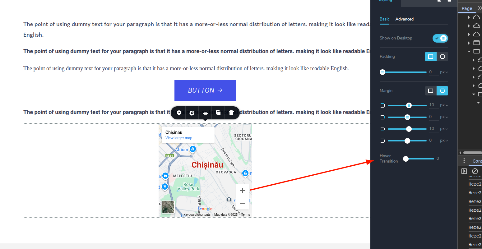
4. Example A: Add a Hover Transition control (keep defaults)
This example adds a sidebar trigger and a custom "Hover Transition" control under Basic, while keeping the built‑in defaults visible.
const mapModule = {
  id: "ThirdParty.Map",
  component: { editor: Map, view: Map },
  title: "My Map",
  options: () => [
    {
      selector: ".mapThirdComponent",
      toolbar: [
        {
          id: "toolbarCurrentElement",
          type: "popover",
          config: { icon: "nc-pin", title: "Map" },
          devices: "desktop",
          position: 10,
          options: [
            {
              id: "tabsCurrentElement",
              type: "tabs",
              tabs: [
                {
                  id: "tabCurrentElement",
                  label: "Map",
                  options: [
                    {
                      id: "address",
                      label: "Address",
                      type: "inputText",
                      placeholder: "Enter address",
                      default: { value: "Chisinau" },
                    },
                    {
                      id: "zoom",
                      label: "Zoom",
                      type: "slider",
                      config: { min: 1, max: 21 },
                      default: { value: 9, suffix: "inch" },
                    },
                  ],
                },
              ],
            },
            // Sidebar trigger
            { id: "advancedSettings", type: "advancedSettings", title: "Settings" },
          ],
        },
      ],
      sidebar: [
        {
          id: "sidebarTabs",
          type: "sidebarTabs",
          tabs: [
            {
              id: "styles",
              title: "Styling",
              label: "Styling",
              options: [
                {
                  id: "settingsTabs",
                  type: "tabs",
                  config: { align: "start" },
                  tabs: [
                    {
                      id: "settingsStyling",
                      label: "Basic",
                      options: [
                        // Custom control
                        { id: "hoverTransition", type: "slider", label: "Hover Transition", position: 100 },
                      ],
                    },
                    { id: "moreSettingsAdvanced", label: "Advanced", options: [] },
                  ],
                },
              ],
            },
          ],
        },
      ],
    },
  ],
};
5. Example B: Disable all default sidebar items
This example shows the pattern to hide every built‑in control in both tabs, without adding any custom ones. You can mix this with your own controls as needed.
const mapModule = {
  id: "ThirdParty.Map",
  component: { editor: Map, view: Map },
  title: "My Map",
  options: () => [
    {
      selector: ".mapThirdComponent",
      toolbar: [
        {
          id: "toolbarCurrentElement",
          type: "popover",
          config: { icon: "nc-pin", title: "Map" },
          devices: "desktop",
          position: 10,
          options: [
            {
              id: "tabsCurrentElement",
              type: "tabs",
              tabs: [
                {
                  id: "tabCurrentElement",
                  label: "Map",
                  options: [
                    {
                      id: "address",
                      label: "Address",
                      type: "inputText",
                      placeholder: "Enter address",
                      default: { value: "Chisinau" },
                    },
                    {
                      id: "zoom",
                      label: "Zoom",
                      type: "slider",
                      config: { min: 1, max: 21 },
                      default: { value: 9, suffix: "inch" },
                    },
                  ],
                },
              ],
            },
            // Sidebar trigger
            { id: "advancedSettings", type: "advancedSettings", title: "Settings" },
          ],
        },
      ],
      sidebar: [
        {
          id: "sidebarTabs",
          type: "sidebarTabs",
          tabs: [
            {
              id: "styles",
              title: "Styling",
              label: "Styling",
              options: [
                {
                  id: "settingsTabs",
                  type: "tabs",
                  config: { align: "start" },
                  tabs: [
                    {
                      id: "settingsStyling",
                      label: "Basic",
                      options: [
                        { id: "margin", type: "margin", disabled: true },
                        { id: "padding", type: "padding", disabled: true },
                        { id: "showOnDevice", type: "switch", disabled: true },
                      ],
                    },
                    {
                      id: "moreSettingsAdvanced",
                      label: "Advanced",
                      options: [
                        { id: "zIndex", type: "slider", disabled: true },
                        { id: "customID", type: "inputText", disabled: true },
                        { id: "customClassName", type: "inputText", disabled: true },
                      ],
                    },
                  ],
                },
              ],
            },
          ],
        },
      ],
    },
  ],
};